Lesson for 9th grade, 6 weeks, acrylics or gouache


Lesson for 9th grade, 6 weeks, acrylics or gouache


Lesson for 7th grade, oil pastel plus white and peach acrylic on large black paper
Lesson for 9th grade, 10-13 days:
This is a beginner-friendly unit, but it asks a LOT from students. They'll have to struggle and practice to stay afloat. As soon as a student memorizes facial proportions, she can make a face look like a plausible human being. And that's the goal, because capturing likeness doesn't matter—capturing likeness well is for experienced artists who've drawn 50 or 100 faces. But they'll capture partial likeness, and most will be proudly showing off, and maybe framing their final results.
Whoever teaches portraiture should expect to be on his feet for this entire unit. Expect to move quickly around the tables, checking everyone's proportions. Whoops, that face is too wide, eyes too far apart, mouth too low, forehead too small, lower lip too dark. Double check the angle of the jawline. See how the ear is attached at an angle? You can't see the top of the head in the reference photo, but let's estimate where it should be.
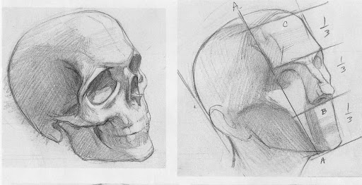
I start the unit by drilling basic proportions in front view and 3/4 view. Later, I add masterclasses for eyes, nose, lips, and hair. Each masterclass uses a different medium (to keep it fresh).
Day 1 should stretch into 2 or 3 days if kids need more practice. I split the class into intermediate and beginner (they choose). Intermediate students follow a detailed skull draw-along from a YouTube vid, and beginners work with me. We do draw alongs until they're at a point where they can draw a plausible human being.

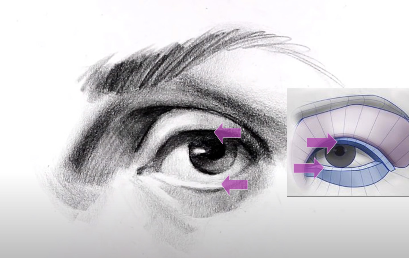
Day 2-3 begins with an eye masterclass, and then students draw a side-lit character from a movie still in pencil (I let them choose from 5 photos)

Day 4-5 begins with a nose masterclass, and then students draw a portrait in 2 tones of ink (they'll use 5+ tones if you let them, so you have to stand fast with the 2 tones policy).

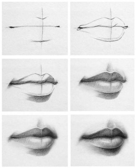
Day 6-7 begins with a lips masterclass, and then students draw a portrait in white chalk.

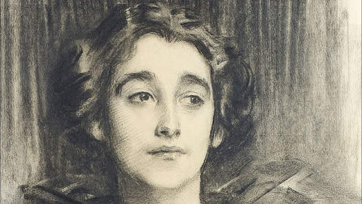
Day 8-9 is charcoal copy of a Sargent drawing.


7th Graders made the castles above from sketchup models.
Students spent 2-3 days learning sketchup as described in <<this old post>>. Then on Day 4, I showed them how to import their screenshots into Dzine.ai as structure references. The class brainstormed interesting prompt ideas like: "Castle underwater surrounded by coral and sharks" or "Castle next to a volcano, at night with lightning in the sky, a lava river . . ."
Students made these with structure match at 0.8. A few beautiful castles had mid or low structure match levels, but I haven't posted those here.
I suggested everyone start with the ANIME styles, especially Vivid Tableaux.

Tactics for 11th and 12th.
This semester, tens of thousands of secondary art teachers presented their students with slideshows on good composition. All probably taught students about the rule of thirds and atmospheric perspective. Half probably discussed leading lines, balance, avoiding tangent edges, and the virtues of worm's eye view.
These prescriptions are useful (and I teach some of these principles too—especially unusual camera angles). But if your top students follow all of the above, they'll still only rise to Level 4 or 5 (on 1-to-10, newb-to-pro scale).
In this post, you'll see another magic bullet that doesn't get talked about: a growth-hack that will lift your best students' art to Level 7 (this skill's as important as learning perspective or artistic anatomy, but far easier to pick up). Below, you'll hear from Paul Felix, one of the top 15 illustrators living today—he designed San Fransokyo for Big Hero 6. You'll also learn what artists like Kandinsky and Klee did wrong. The new tricks take a minute to learn and yield highly effective paintings.
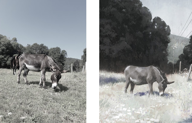
Let's start by looking at what Aurélie Bouquet, a French illustrator, painted from a reference photo. How did she change the scene she observed?


Imagine that each high school student stands on a ladder representing their lifetime growth as an artist. But usually, the students can't see what's ahead of them, what potential they have to grow. Why not show them the stories-in-pictures below, so they can see what years of study and practice can accomplish.
____
Anthony Avon - from age 16 to 24


11th-grade IB Visual Arts cohort made these a long time back, but I wasn't allowed to publish these until now (IB rules). Students' only constraint was that they had to choose a limited palette.
Each canvas shown below is VERY LARGE:


10th-grade Art Lesson:
When I was in school, my art classes never taught perspective. Blessing in disguise, because I learned from a wonderful book linked at the bottom of this post. That book took me farther down the rabbit hole than any reasonable kid would go (ex: book got me sketching praying mantises and alligators in perspective). Nothing has increased my breadth as an artist more than leveling up my perspective drawing skills.
One cool thing about teaching perspective: students who do well here are often different from those who do well with the other art lessons I run. But be warned that this is a challenging lesson for all students, and you'll be working closely with each of them to get their paintings across the finish line.
Accommodation for weaker students: They may work in monochromatic watercolor.
_______
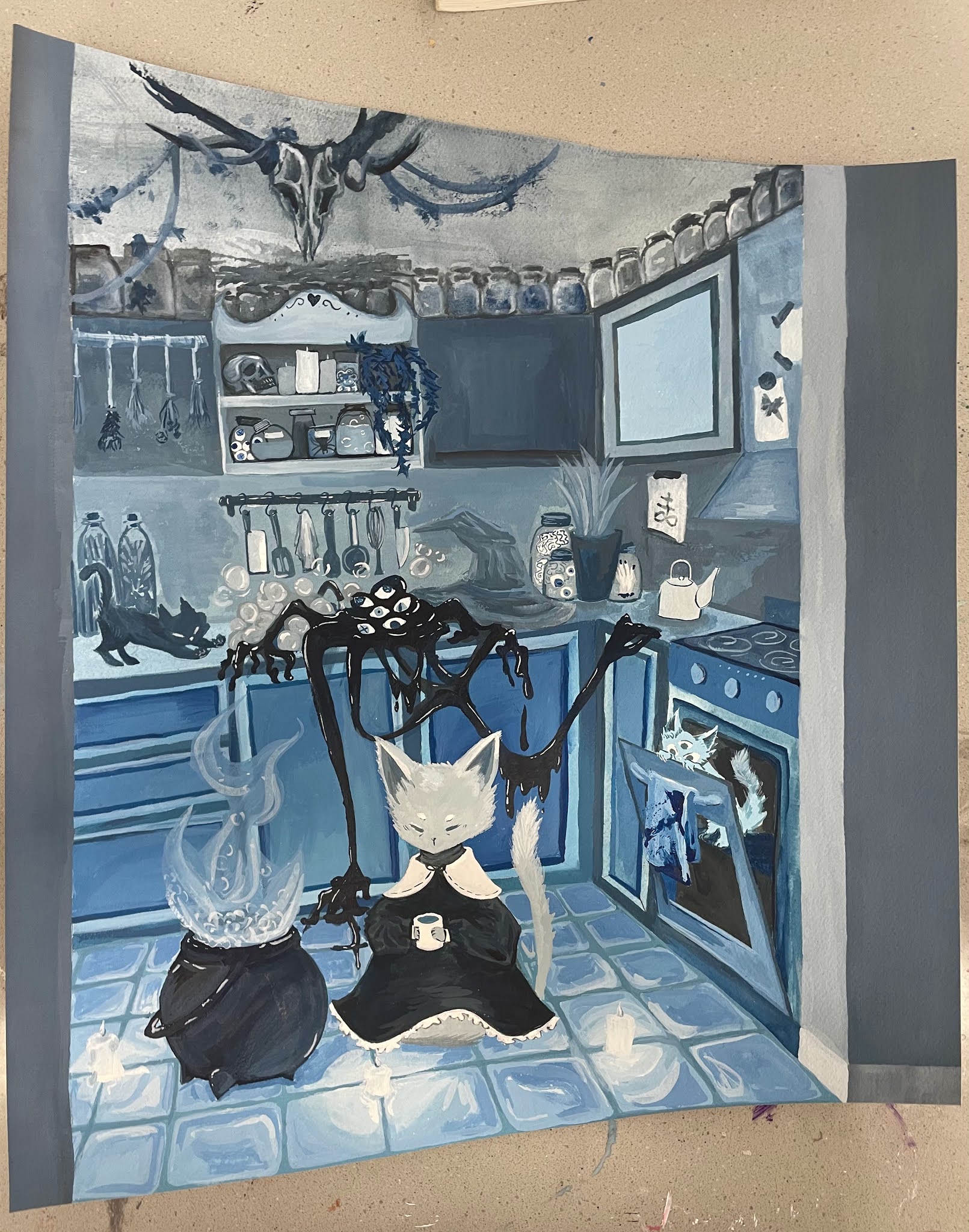
The students are charged with designing an interior for a themed resort hotel (themes = haunted forest theme, cats theme, pirate theme, and so on).
They have to figure out lighting and how to render their interesting interior objects in perspective, with cast shadows, etc. Top examples:


Lesson for 7th grade
Students started by copying <trees> by Brayden Barrett. Next, they spent a couple days learning basic linear perspective with draw-alongs (they didn't have to use perspective in this project, but these exercises taught them about using a horizon and how to place items at varying distances on a ground plane). Third, they made thumbnails of their alien trees planted into alien landscapes (swamps, volcanic terrain, canyons, floating islands, etc).

While making thumbnails, they took a day to play with dzine.ai, and to AI-generate some reference photos for their proposed scene.
Using their AI refs, their Brayden Barrett refs, and their thumbnails, each student began an A3 watercolor using a limited palette (their choice of one of the below color schemes):


Lesson for
9th grade, ceramicsStudents study historic aircraft and spacecraft as they design these shoes. I told them to imagine they had baskets of airplane components like missiles, propellers, and motors, and they could reassemble them into footwear.
They learned slab construction, and they built these shoes out of paper before trying them in clay: