Tactics for 11th and 12th.
This semester, tens of thousands of secondary art teachers presented their students with slideshows on good composition. All probably taught students about the rule of thirds and atmospheric perspective. Half probably discussed leading lines, balance, avoiding tangent edges, and the virtues of worm's eye view.
These prescriptions are useful (and I teach some of these principles too—especially unusual camera angles). But if your top students follow all of the above, they'll still only rise to Level 4 or 5 (on 1-to-10, newb-to-pro scale).
In this post, you'll see another magic bullet that doesn't get talked about: a growth-hack that will lift your best students' art to Level 7 (this skill's as important as learning perspective or artistic anatomy, but far easier to pick up). Below, you'll hear from Paul Felix, one of the top 15 illustrators living today—he designed San Fransokyo for Big Hero 6. You'll also learn what artists like Kandinsky and Klee did wrong. The new tricks take a minute to learn and yield highly effective paintings.
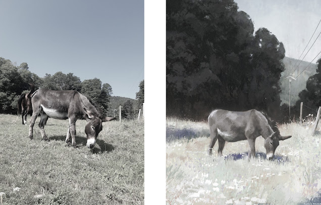
Let's start by looking at what Aurélie Bouquet, a French illustrator, painted from a reference photo. How did she change the scene she observed?

She narrowed contrast within the grass, within the trees, and the on the donkey.
Look what she did to the telephone pole: it almost disappears into the hill behind it. Why did she paint the pole so faintly?
Also, why did she enlarge the mass of trees behind the donkey? The first answer is she wanted to create
a variety of big, flat shapes in this composition. And second, she wanted to put some distance between the light sky and the other light values: the grass and donkey.
The very, very highest tier of illustrators—like N.C. Wyeth, Dean Cornwell, Craig Mullins, Jaime Jones, and Syd Mead—try to unify their dark shapes and unify their light shapes. So did George Bellows, Rembrandt, and Turner. Light against light and dark against dark.
(Clockwise from TL: Craig Mullins, Pruett Carter, Howard Pyle, Thomas Schaller)
With a little grit, we can look past the cheesy and/or creepy subjects in these paintings. All we care about is the compositions, and they're exceptional. Yet, none of them obey the rule of thirds.
Fun Fact: Craig Mullins (at TL) was one of the top viz dev guys working on Halo and Tangled. He was Paul Felix's peer on Tangled. He teaches a digital painting masterclass anyone can access on schoolism.com.
Look at Thomas Schaller at bottom-left. How would your most diligent students have painted the man in the sunlit gallery? Your students would've spent 10 hours on outlines, excruciatingly detailing every object in every painting on the sunlit wall. They'd outline the frames and the room's architectural flourishes. But they'd lose the forest for the trees because in the end, their sunlit areas would be the same value as the shadow areas. Schaller has a better way: he roughs in loose washes, and the result is orders of magnitude more powerful.
Here are more high-impact paintings spanning hundreds of years:
(Clockwise from TL: Devin Kurtz, Rembrandt, George Bellows, Degas)
Disney Legend Paul Felix (one of the top 15 illustrators living today, Howard Pyle's 2024 equivalent) adds context:
Based on what he wrote, Paul Felix would probably approach the donkey painting much the same way as Aurélie Bouquet did.
Modernists like Kandinsky, Juan Miro, Yves Tanguy, Paul Klee, and Fernand Leger rejected Felix's prescription and made decent enough paintings, albeit dominated by lines or chaotic, fussy shapes. But they would all have made better pictures had they observed this principle. The most famous modernists were like Sputnik 1: we know their names because they were original and historically notable, not because they were the best.
As a side note, Syd Mead tried his hand at abstract paintings too.
The trending Australian painter eX De Medici isn't above criticism, because she too would have made better pictures if she'd applied this principle. Here's an example of how not to organize your values:
In all likelihood she painted this way on purpose—really, how could she not have known better? And her work's theme is excess.
Here's a bad, over-fussy composition by John Constable. This is how students try to paint, but it's not half as successful as George Bellows and Rembrandt above:
Next are two screenshots from Airi Pan's tutorial where she takes her work from Level 4 to Level 7 in the span of minutes (both stages shown below are far from finished):
Most students would stop at the version on the left if they were painting the above scene. And then, tragically,
they'd outline all their shapes.
Thou shalt paint like Airi Pan and George Bellows, not eX De Medici or John Constable.
(Even if a student opts to go rogue later, they'll know their craft: how good pictures are made.)_____
So, after you've exposed your 11s or 12s to painters who organize values well, how should they actually apply the lessons of the best role models? You might point them towards 4 goalposts:
- When they plan their next painting, sketch thumbnails with values, not just lines. Like Paul Felix does in his notes. (some might find this process quicker with procreate because you can make a line drawing, then use the lasso tool to lay down multiply or screen layers for quick values).
- Choose your focal point at the start of a painting, and make that focal point the most contrasty part of the painting.
- Work in passes, rather than bringing one small area to a polish and moving on. Also tone your canvas at the start of a painting.
- In direct light, cast shadows trump local values . . .
Suppose a student is painting the back-tattoo above. She must paint the sunlit tattoo ink as a mid-brown, and then in the shadow, tattoo ink goes to black. Similarly, if white Dalmatian fur is in shadow, she'd paint it dark-grey (same value as the sunlit black fur).
More, she should habitually push sunlit areas lighter than how they'd look in photos to improve 3-dimensionality:
When you do that, you get a painting that looks more alive than a photo of the same subject!
Summary:
- For local patterns like grass, foliage, and wallpaper, narrow the value range. Remember how the donkey painter modified her grass to make it less contrasty?
- As much as you can, unify your light shapes and unify your dark shapes.
- For your subject: keep everything in shadow darker than everything in light. Paint leopard spots lighter where sun hits them (even if it doesn't look that way in your photo ref).


No comments:
Post a Comment