11/13/24

10 Days of Portraiture

9th grade unit, 10-13 days: 

This is a beginner-friendly unit, but it asks a LOT from students. They'll have to struggle and practice to stay afloat. As soon as a student memorizes facial proportions, she can make a face look like a plausible human being. And that's the goal, because capturing likeness doesn't matter—capturing likeness is for pros who've drawn many dozen faces.

Whoever teaches portraiture should expect to be on his feet for this entire unit. I need to move quickly around the tables, checking everyone's proportions. Whoops, that face is too wide, eyes too far apart, mouth too low, forehead too small, lower lip too dark. Double check the angle of the jawline. See how the ear is attached at an angle? You can't see the top of the head in the reference, but let's estimate where it should be.

I start the unit by drilling basic proportions in front view and 3/4 view. Later, I add masterclasses for eyes, nose, lips, and hair. 

Day 1 should stretch into 2, 3, or 4 days when kids need more practice. I split the class into intermediate and beginner (they choose). Intermediate students follow a detailed skull draw-along from a YouTube vid, and beginners work with me. We do draw alongs until they're at a point where they can draw a plausible human being. 


Day 2-3 begins with an eye masterclass, and then students draw a side-lit character from a movie still in pencil (I let them choose from 5 photos)


Day 4-5 begins with a nose masterclass, and then students draw a portrait in 2 tones of ink.


Day 6-7 begins with a lips masterclass, and then students draw a portrait in white chalk.


Day 8-9 is charcoal copy of a Sargent drawing.


Day 10 is a hair masterclass. The exercise forces students to discern subtle values in hair, to not make hair flat. They visualize the hair as a solid mass.

After Day 10, they take self-portrait photos with dramatic side-lighting and draw their own portraits at a large scale. This goes on for 5 weeks. See lesson.

I would have LOVED for an opportunity to learn this in grade 9 (or 10, 11, 12—I wasn't taught any portraiture until university).

______

Over the first 10 days, beginners are just trying to get eye shape right, get noses in the right position and size. It takes time, practice, and teacher support. Here's what I'm looking for during and especially after the first 10 days:
  • Top lip dark and bottom lip light


  • Underside (down-plane) of nose is dark (except when lit from below)
  • Don’t add heavy outlines where you don’t see them (see omitted outline on nose & lips above)

  • Thickness of top eyelid is dark, thickness of bottom is light (except when lit from below)


  • Hair is not a flat value, is has light and dark patches
  • Don't draw eyelashes

  • Separate side and front planes of nose (usually a change in values, or a highlight between the two planes)
  • Nose cuts inward right below forehead (see skull below)
  • chin-to-nose = nose-to-eyebrows = eyebrows-to-forehead
  • Treat teeth as one connected mass (minimal outlines between teeth)


9/19/24

Turning Sketchup models into Dzine AI renders


7th Graders made the castles above from sketchup models.

Students spent 2-3 days learning sketchup as described in <<this old post>>. Then on Day 4, I showed them how to import their screenshots into Dzine.ai as structure references. The class brainstormed interesting prompt ideas like: "Castle underwater surrounded by coral and sharks" or "Castle next to a volcano, at night with lightning in the sky, a lava river . . ."

Students made these with structure match at 0.8. A few beautiful castles had mid or low structure match levels, but I haven't posted those here.

I suggested everyone start with the ANIME styles, especially Vivid Tableaux.

Above: Emily, Tanay, Alexia


4/30/24

Beyond the Rule of Thirds: A New Paradigm for Grand Compositions

Tactics for 11th and 12th.

This semester, tens of thousands of secondary art teachers gave presentations on good composition. All probably taught students about the rule of thirds and atmospheric perspective. Half probably discussed leading lines, balance, avoiding tangent edges, and the virtues of worm's eye view.

These prescriptions are useful (and I teach some of these principles too—especially unusual camera angles). But if your top students follow all of the above, they'll still only rise to Level 4 or 5 (on 1-to-10, newb-to-pro scale). 

In this post, you'll see another magic bullet that doesn't get talked about: a growth-hack that will lift your best students' art to Level 7 (benefits comparable to learning perspective or artistic anatomy, but this skill's far easier to pick up). You'll hear from Paul Felix, one of the top 15 illustrators living today—he designed San Fransokyo for Big Hero 6. You'll also learn what artists like Kandinsky and Klee did wrong. The new tricks take a minute to learn and yield highly effective paintings.

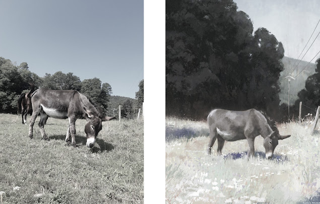
We'll start by looking at what AurĂ©lie Bouquet, a French illustrator, painted from a reference photo. How did she change the scene she observed? 

She narrowed contrast within the grass, within the trees, and the on the donkey. 


Look what she did to the telephone pole: it almost disappears into the hill behind it. Why did she paint the pole so faintly?

Also, why did she enlarge the mass of trees behind the donkey? The first answer is she wanted to create