Tactics for 11th and 12th.
This semester, tens of thousands of secondary art teachers gave presentations on good composition. All probably taught students about the rule of thirds and atmospheric perspective. Half probably discussed leading lines, balance, avoiding tangent edges, and the virtues of worm's eye view.
These prescriptions are useful (and I teach some of these principles too—especially unusual camera angles). But if your top students follow all of the above, they'll still only rise to Level 4 or 5 (on 1-to-10, newb-to-pro scale).
In this post, you'll see another magic bullet that doesn't get talked about: a growth-hack that will lift your best students' art to Level 7 (this skill's as important as learning perspective or artistic anatomy, but far easier to pick up). Below, you'll hear from Paul Felix, one of the top 15 illustrators living today—he designed San Fransokyo for Big Hero 6. You'll also learn what artists like Kandinsky and Klee did wrong. The new tricks take a minute to learn and yield highly effective paintings.
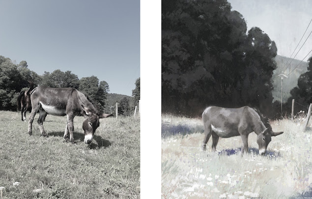
Let's start by looking at what Aurélie Bouquet, a French illustrator, painted from a reference photo. How did she change the scene she observed?


